


Painting a conservatory a certain colour changes its look and feel, but almost always plays a supporting role to the main feature: its windows. To make sure your conservatory walls are the right colour this year, choose a paint colour that complements your view and works with the contents of the space.
To help inspire your conservatory paint choices, all of our examples below are accompanied by images from real projects we’ve worked on. You’ll get a sense of the look that each colour palette brings to real rooms, rather than trying to imagine the effects.
Where Should You Paint In Your Conservatory?
Our focus here is on painting plastered conservatory walls or exposed bricks. We’re not touching on painting uPVC (the plastic in many conservatories) or other non-brick structural materials. We don’t usually recommend that you attempt to paint these materials.
You can paint the solid surfaces of your conservatory without too much trouble. If the walls are already plastered, go ahead as you would with any interior wall. Some people also like to paint exposed brick instead, which is possible so long as you use an appropriate primer first. Either way, there’s certainly enough space for decoration on your conservatory walls.
Paint Ideas For Conservatories
Now you know which parts of your conservatory might need painting, let’s discuss the most popular paint colours in the modern day, getting you ready for 2025 and beyond.
Cool, Neutral White
White paint is an unobtrusive, clean colour for a conservatory that won’t clash with anything. A white conservatory is essentially a pleasant frame for the view from the windows. It will also act as a clean backdrop for any furniture, flooring and ornaments you choose to include in the space. White is a very light colour, which means that it will help the conservatory to feel bright and airy, even on darker days.
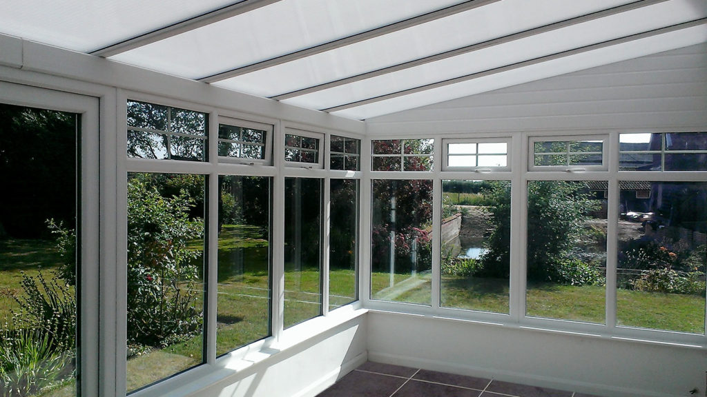
If you’re worried about your paint colour being too overbearing and detracting from the other features of your conservatory, white is the perfect choice.
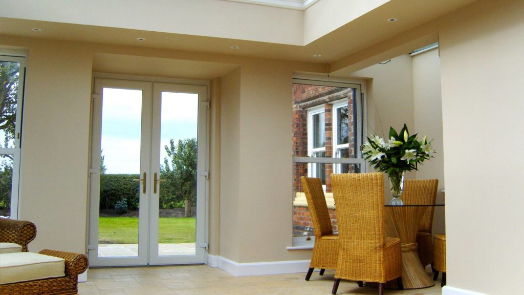
Comfortable Off-Whites and Creams
Off-whites and creams are a little stronger than white paint, but have many of the same benefits. Like white, they are cool, bright colours that go with almost anything. Creams also have the added advantage of being a little closer in shade to many people’s home interiors, especially in newer houses. These colours are popular due to their ability to look good in practically every home, which makes them a great choice to deepen the connection between your conservatory and the rest of your home’s interior.
If you’re worried about white being too cold or clinical but you want to remain as neutral as possible, we’d recommend painting your conservatory walls cream.
Warm Orange
An orange colour palette offers something a little stronger than the neutral paint colours we’ve seen so far. Oranges, terracottas and apricots have the potential to transform a conservatory from a neutral extension of the home or garden to a feature in its own right, complete with a strong, warm identity. There’s an unmistakable Mediterranean feel to interiors that make use of this colour palette, which is the perfect way to bring out the summer feeling in your conservatory. If you’re lucky enough to live in an area with lots of sun in the summer, orange conservatory walls are a top choice.
There’s no denying that a stronger colour is more demanding of the space than a neutral colour. You’ll need to put more thought into the flooring, furniture and lighting to bring the best out of it. But, if you’re prepared to put time into a space like this, you can be rewarded with a truly stunning addition to your home.
Bold Blues
Bold blue paint is on the opposite side of the colour spectrum to an orange palette, but is no less effective if used in the right way. Blue takes many of our comments for orange paint to the next level. In the same way, it needs thought regarding the rest of the space, but is perhaps less conducive to tasteful combinations with many types of furniture and lighting.
However, it’s hard to beat the striking vibrancy of a blue conservatory decorated well. From greenish aquamarines like the one shown below, to cooler, deeper blues, there is a uniqueness to this colour palette that is sure to put your mark on the conservatory and make it feel like your own. If you having darker green bushes and plants in your back garden, a dark blue conservatory will blend in well. If your garden is lighter in tone and more colourful, softer baby blues are more suitable.
The Understated Charm Of Exposed Brick
Unpainted brick walls have a charming simplicity that makes them worth considering alongside your coloured paint options. Many bricks have an attractive colour already, work well with most furniture, and don’t detract from the view out of the windows. That’s why many conservatory owners choose to keep the exposed brick look when designing and decorating their conservatory.
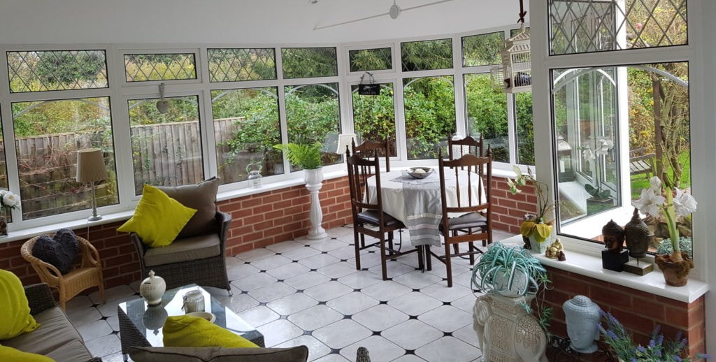
Brick conservatories tend to feel more like an outdoor space than other rooms in the house. If you like sitting in your conservatory and feeling as if you’re in the garden, exposed brick is perfect for you. This almost rustic look creates a nice transition between inside your home and your garden.
However, our earlier paint recommendations will likely suit you better if you want to see your conservatory as a seamless extension of the house.
Contact KLG for Conservatory Refurbishment
Painting works on the inside, but if you’re looking to spruce up the outside of a tired conservatory, a tiled roof is one of the best long term choices you can make. Contact KLG to discuss modernising your conservatory with a long-lasting, insulated tiled roof. We also provide stunning new conservatories and full conservatory refurbishments where necessary.